
The R programming language is an open-source, interactive language that was designed for manipulating datasets, creating visualizations, and performing statistical analyses. It is based on the S language, which was originally developed at Bell Laboratories. R is a full-featured language (it supports conditionals, loops, functions, I/O, etc.) and its functionality can be easily extended by installing additional packages. The environment in which R code is run has support for Linux, Mac OS X, and Windows. For a more detailed description of the R programming language, please visit: http://www.r-project.org/about.html. In this post I will provide an introduction to R by walking through the steps required to manipulate, visualize, and statistically analyze a dataset. These steps were tested on R for Windows, although they should work on other platforms as well.
If you want to follow along with the steps in this post you will first need to install the R environment and language. To download R, visit http://cran.r-project.org/mirrors.html, click on a link for a download mirror (preferably one that is in your country), and then follow the installation instructions for your operating system. After downloading and installing R you will also need to download the dataset that is used in this post to demonstrate R’s capabilities. To download this data, click on the following link: http://netsg.cs.sfu.ca/youtubedata/080903user.zip and then extract the dataset from the zip archive. This dataset contains the number of uploaded videos and friends for approximately two million YouTube users. For datasets with other types of information, please visit: http://netsg.cs.sfu.ca/youtubedata/.
You are now ready to analyze the dataset. Begin by starting the R environment. Under Windows 7 it will look something like this:
After starting the environment you should set the working directory to the directory containing the downloaded dataset. To do this, click “File -> Change dir…” and then navigate to the correct directory. You can now read in the dataset using the following command:
youtubeData <- read.table(“user.txt”)
“youtubeData” is a type of R object known as a data frame. A data frame is like a table, where each row is one data point (or observation) and each column represents an attribute of the data.
In order to view the contents of this data frame you can simply type “youtubeData”. However, because this data frame consists of about two million rows, you will be unable to view all of the output. You can instead view the first five records by typing:
head(youtubeData)
This will print a header (“V1 V2 V3”) and then five rows of data. In order to change the default header to something more meaningful, type:
names(youtubeData) <- c(“User”, “NumUploads”, “NumFriends”)
After reading in the data you may be interested in graphing it in order to find interesting trends. In this example we are going to create a scatterplot where each point represents the number of uploads and friends for a single user. The simplest command for creating this graph is:
plot(youtubeData$NumUploads, youtubeData$NumFriends)
Each point in this graph has the number of uploads as the x-value and the number of friends as the y-value. Note that because this data frame is rather large, this command will most likely take a long time to run. You may want to truncate the data in order to complete the analysis more quickly and to avoid crashing the R environment. To select the first 50,000 rows, type:
youtubeDataSubset <- youtubeData[1:50000,]
After removing these rows you can make the same call to the “plot” function, substituting “youtubeDataSubset” for “youtubeData”. After typing this command, R will produce the following graph:
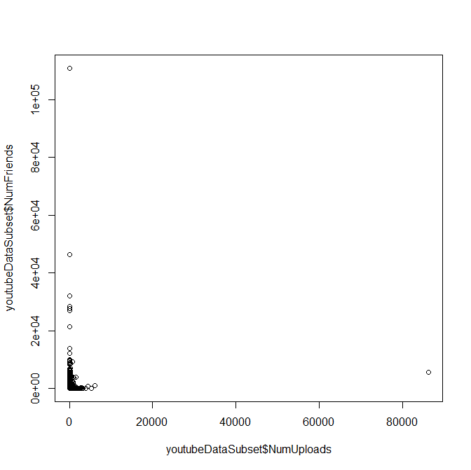
As you can see from this graph, the number of friends and uploads for users are concentrated near the origin. I would have hypothesized that a user with a large number of uploaded videos would also have a lot of friends, but by looking at the graph you can see that this is not the case. It appears as if there are many “low use” accounts in which the user uploaded a few videos, made a few friends, and then stopped using their account regularly.
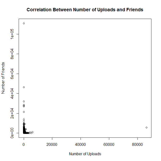
In order to make this graph more suitable for presentation, you should add a title and meaningful names for the axis labels. To create the graph again with axis labels, type:
plot(youtubeDataSubset$NumUploads, youtubeDataSubset$NumFriends, xlab=”Number of
Uploads”, ylab=”Number of Friends”)
To add a title to the graph, type:
title(main=”Correlation Between Number of Uploads and Friends”)
The updated graph should look like this:
Finally, we will determine if there is a statistically significant difference between the number of friends for users with a relatively small number of uploads (ten or fewer) and users with a large number of uploads (greater than ten). In order to do this we will first split the data into two additional subsets: data for users with ten or fewer uploads and data for users with more than ten uploads. You can use the following two commands to split the data:
smallNumUploadsSubset <- subset(youtubeDataSubset,NumUploads <= 10)
largeNumUploadsSubset <- subset(youtubeDataSubset, NumUploads > 10)
You are now ready to perform the statistical test. We will use the Mann-Whitney U-test to compare these two data samples. This is a non-parametric test, meaning that it does not make any assumptions about the distribution of the data. There are a variety of statistical tests to choose from, but I chose this test because it is relatively simple to perform. You should make the following function call in order to compare the number of friends for the two sets of users:
wilcox.test(smallNumUploadsSubset$NumFriends, largeNumUploadsSubset$NumFriends)
This test will produce some output, the most important of which is:
W = 171525405, p-value < 2.2e-16
alternative hypothesis: true location shift is not equal to 0
The key piece of information is the p-value. This value represents the likelihood that there is no statistically significant difference between the two datasets. A p-value that is greater than 0.05 generally indicates that there is not a statistically significant difference between the datasets, although other cut-off points can be chosen. In this case it is clear that the p-value is less than 0.05, so we can say that there is a statistically significant difference between the number of friends for users with ten or fewer uploads and users with more than ten uploads. It is possible to determine which group of users had more friends, but we will not cover those steps in this blog post.
In this post you have learned some basic information about the R language and how to manipulate, visualize, and statistically analyze a dataset. Although I did not exhaustively cover all of the capabilities of R, there are many resources available for you to continue learning. In particular, there is a guide available that was specifically written to cover the quirks that make R different from many other programming languages: http://www.johndcook.com/R_language_for_programmers.html. Another resource is a guide for those trying to start using R relatively quickly: http://www.burns-stat.com/documents/tutorials/impatient-r/. Finally, you can learn more about the R functions used in this tutorial by preceding the function name with a question mark. For example, to see the manual page for “read.table”, type:
?read.table
I hope that you will consider using R the next time that you are faced with a data analysis or visualization challenge. What languages do you currently use to visualize and analyze data? Please feel free to let me know in the comments section.